10 Tips to Boost Your Nonprofit’s Donation Form (Before the Holiday Giving Season)
Recently, I was trying to make a donation to an organization providing emergency food support in Gaza. I had been seeing heartbreaking images on social media of starving children and was eager to do something. I Googled organizations that were helping and clicked on a name that I recognized. I went straight to their donation page, ready to give…but the form didn't load. The website page itself was well designed and made a strong case for my gift, but the place where it told me to put in my credit card details was just blank white space. I refreshed the page, opened the link in Safari instead of Chrome, tried incognito mode…still nothing.
The page did have a little note that I could send them a WhatsApp message for any issues with the site. So, I sent them a couple of sentences to let them know about my donation troubles. Since it was an instant messaging platform, I thought I might get an immediate response. When none came after a few minutes, I put my phone away and went along with my evening.
I got a canned response via WhatsApp at 1:07am that night (“Hello! Thank you for contacting us. To assist you with your request, could we confirm some details? Email address used for the donation, currency, and amount…”). 16 minutes later, I was informed they were disconnecting the chat because they hadn't heard from me. Still no fix to my problem. That was a few weeks ago. I still haven’t made my donation to this organization, and I’m not sure that I ever will.
I went from being an engaged, fired up donor ready to support this cause to a frustrated person who felt like it was a waste of time to try to figure out their technology.
Don’t let this story happen to you! The holiday season is coming soon—a time when you’ll likely have an influx of visitors to your website trying to make a gift. You have a brief window of time when your potential donor is motivated to make a gift. If your donation form doesn’t load, or the process is clunky, you’re at risk of losing that gift.
When was the last time you tested your nonprofit’s donation form? Can your elderly neighbor easily make a gift from her desktop computer using Internet Explorer? How long does it take? Is the process as easy on an iPad using Safari as it is on an Android phone? Take our free quiz to test how healthy your donation form is. Through 10 questions, you’ll get a score and find out what to tweak to make the process seamless.

A broken or clunky donation form can turn away even the most motivated supporters. Consider these 10 simple tips to ease any potential friction points in your donation form. Following these strategies will help you make sure your donors have a smooth giving experience.
1. Keep it fast.
When someone clicks your donate button, your page should load close to instantly. Anything longer than a 3-second delay can cause 40% of potential donors to drop off. Take out your phone and start the stopwatch feature, then click on the donate button on your website. How long until the full donation form appears? Clicking a donation button on your website should result in a popup form. And if you have a donation page on your website, use an embedded form. Avoid any links that open in a new tab!

charity: water’s donation page looks and feels just like the rest of their site.
2. Stay on brand.
Your donation form should look and feel like the rest of your website. If not, your supporters might question whether they’re actually in the right place. Use your nonprofit’s colors, fonts, and style so donors know it’s you.
3. Use emotional imagery.
A strong, emotion-driven photo can spark connection and action. Do you have an image that conveys feelings like joy, love, urgency, or compassion? If the photo is showing people, are there no more than 2-3 people who are making eye contact with the camera? If not, change your image to one that is—that’s the most engaging kind!

4. Talk directly to your potential donor.
How many times does your form use the word “you”? Your form should briefly explain the problem your organization is up against and how your potential donor’s gift can solve it. Make a clear and compelling case for why your potential donor should give to you—right now. Keep your text copy at a 6th–8th grade reading level. Aim to use twice as many “you”-focused words as “we”-focused words. Copy and paste your text into the Bloomerang Communication Audit tool to test it.
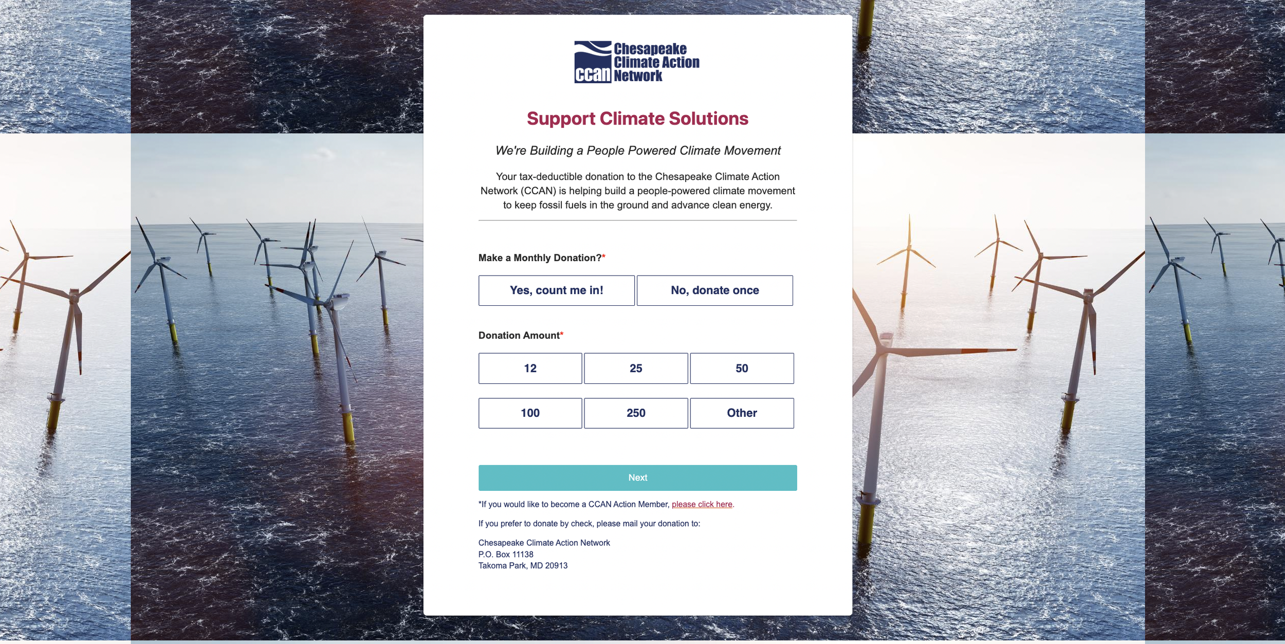
A straightforward and simple example from the Chesapeake Climate Action Network.
5. Suggest giving amounts.
Include preset donation levels to guide donors—and go further by connecting amounts to impact or specific needs (e.g., $50 can provide school supplies for one child). Be sure to list your suggested donation amounts from low to high so that you don’t undervalue a potential donor who only has $10 or $20 to give. If your donation platform has the option to personalize donation amounts using AI, turn that option on. Doing so can increase your donation revenue by about 11%.
6. Simplify your formatting.
Keep accessibility standards in mind. Put your website's colors through this free online contrast checker and see if they pass or fail. You should always use high color contrast, large fonts, and white space.
7. Limit the number of fields you ask for.
Avoid overwhelming supporters with one long, endless form. They could see how long it is and give up! Every extra field increases friction. Only ask for the essentials (name, contact info, payment). Skip unnecessary custom questions unless they’re truly critical. Include a maximum of two optional fields.
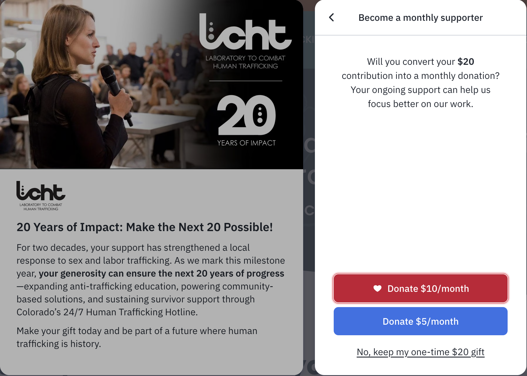
A great example of a monthly donation prompt from the Laboratory to Combat Human Trafficking.
8. Encourage monthly giving.
Use your donation form to invite donors to make their gift monthly. Even one or two prompts during checkout can significantly grow recurring support, but make sure they're not too passive. Use text and visual cues at various points. You can bold or highlight text or use a bright color. Or, add in an arrow pointing to the monthly giving option. Your donation form likely has this option built in (especially if you use Fundraise Up, which excels in this area)—make sure the setting is turned on.
9. Optimize for mobile.
At least half of your donors will give on their phone. Test your form on multiple devices to make sure it looks good and fields are easy to fill. Make sure you have built-in payment options for Apple Pay, Google Pay, PayPal, and Venmo. If someone has to get off the couch to go find their credit card because Apple Pay isn't enabled, you'll probably lose them when they get distracted!
10. Test your full donation journey.
Make a test donation from start to finish. Recruit at least five other people to do the same, on five different devices. Ask that elderly neighbor to give it a try, and do the same with your Gen Z nephew. Have them use a stopwatch to actually time how long it takes to go from searching for your organization and finding the donate button on your website to making their gift and getting to the confirmation page.
If they ran into any issues, did they find an easy way to get in touch with you for help? Ideally, the entire donation process should take less than 30 seconds. Consider where you can shave off time—every second counts.
BONUS TIP: Don’t sleep on your donation confirmation page.
Your “thank you” page shouldn’t be a dead end. In addition to a thank-you message, include another call to action that keeps supporters engaged. What next step can they take? Encourage them to follow your organization on social media or ask five friends to join them in making a gift.
A well-designed donation form has the potential to convert more donors, deepen their connection with your cause, and earn more revenue for your nonprofit this year-end fundraising season.

Need help putting these tips into practice? Book a Free Office Hours time slot with our digital marketing experts. Bring this or any other digital marketing question you have, and we’ll spend an hour troubleshooting challenges and brainstorming solutions with you.